Brand · v2.0
The brand, in a few rules.
Logos, colours, typography and tone of voice, with the files ready to use. For partners, the press and anyone working with us.
ZIP · SVG, PNG, PDF, tokens and fonts · 1.2 MB
The point that rises.
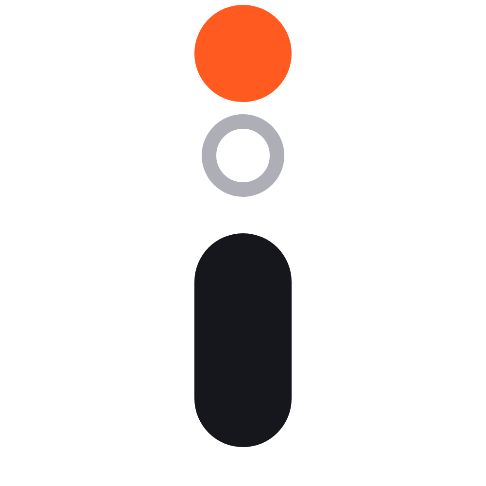
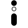
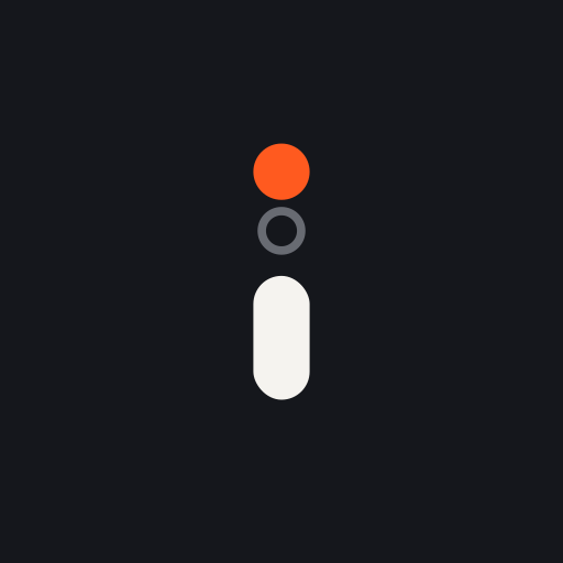
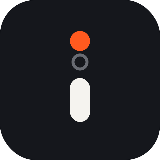
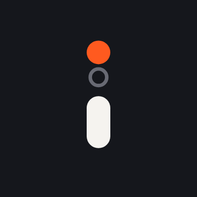
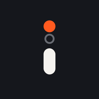
The symbol is an «i» whose dot has risen above where it used to be. The ring marks the starting level — the baseline we measure. The orange dot is the result.
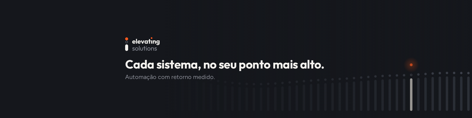
The name repeats the gesture: the dot of the «i» in elevating is lifted, in Signal Orange. That is why the name can stand on its own without losing the idea.
One gesture, four formats.
The horizontal lockup is the reference. The stacked lockup serves square formats and is always left-aligned. On dark backgrounds use the reverse version; on light backgrounds, the colour version.




Compact symbolLight background
Space, size and what never to do.
Clear space
Around the logo, on every side, keep a free space equal to the diameter of the raised dot. No text, image or page edge enters that area.
Minimum sizes
- 16 pxCompact symbol, on screen
- 24 px · 5 mmFull symbol, on screen and in print
- 120 px · 28 mmHorizontal logo, width

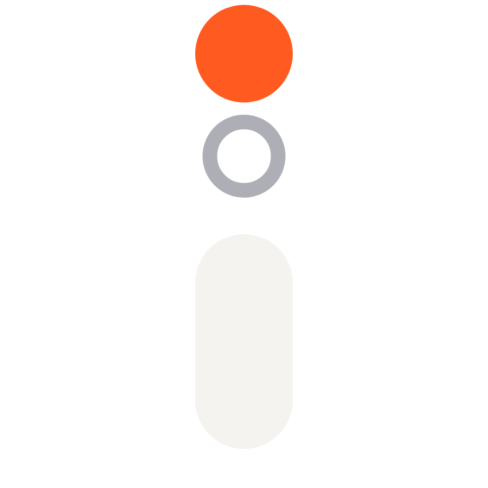
Below 24 px, always use the compact symbol, without the ring.
Six ways to lower the point
Do not colour the stem or the ring orange.
Orange is only the raised dot.
Do not centre the stacked lockup.
Symbol and name are always left-aligned.
Do not put the dot back in its place.
Without the rise, it is just an «i».
Do not stretch or squash.
The dot and the ring are circles: always scale in proportion.
Do not add effects.
No shadows, glows, outlines, embossing or gradients.
Do not use orange for text on a light background.
On light backgrounds, text and links use Deep Orange, #B83A0C.
Graphite for everything. Orange for the result.
Dark first on screen, light in documents. Signal Orange covers at most 5% of any surface: the raised dot, the main action and one key figure per view.
Graphite
- HEX
- #15171C
- RGB
- 21 23 28
Main dark background and text on light backgrounds.
Paper
- HEX
- #F5F3EF
- RGB
- 245 243 239
Light background and text on dark backgrounds. Never pure white.
Steel Grey
- HEX
- #8C8F98
- RGB
- 140 143 152
Secondary text and the symbol’s ring on dark backgrounds.
Signal Orange
- HEX
- #FF5A1F
- RGB
- 255 90 31
Only the raised dot and the main action. At most 5%.
Deep Orange
- HEX
- #B83A0C
- RGB
- 184 58 12
Orange text and links on light backgrounds.
The display states, the text explains, the mono measures.
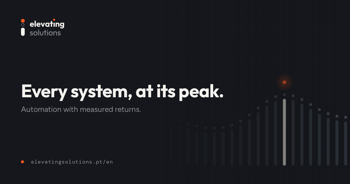
Every system, at its peak.
Every project starts with a baseline and ends with a number.
baseline · t₀ → t₁ · Δ
All three families are licensed under the SIL Open Font License 1.1 and ship with the kit as woff2.
We speak like people who measure, in two languages.
European Portuguese first, British English as its pair. The taglines are fixed pairs and are not translated freely.
- Main tagline
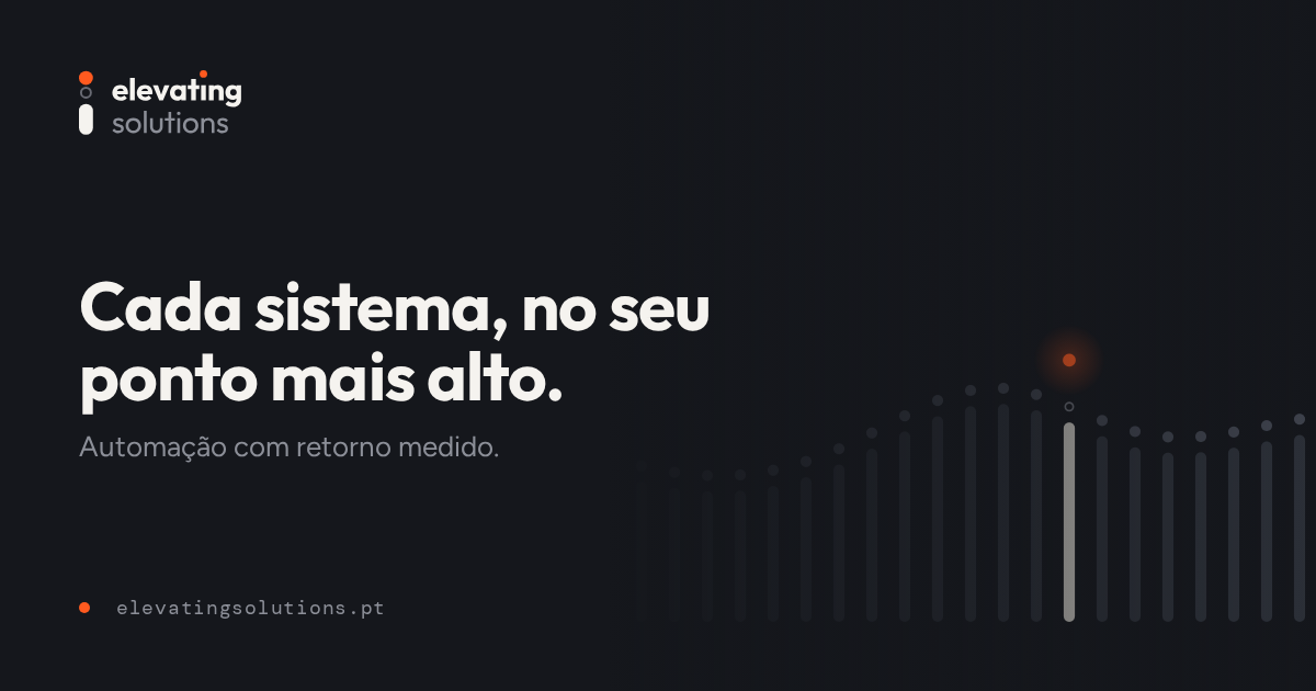
Cada sistema, no seu ponto mais alto.
Every system, at its peak.
- Secondary tagline
Automação com retorno medido.
Automation with measured returns.
Precise
Numbers and facts before adjectives.
Every proposal states what we will measure, how and when.
Calm
Advanced technology explained without jargon.
If we cannot explain a solution in plain language, it is not ready yet.
Ambitious
We talk about levelling up, always with proof.
The goal is the highest point possible — and the number that shows it.
We write
- “We start by measuring the process as it is today.”
- “We explain what the AI does, and what it does not.”
- “Every project ends with a number.”
We do not write
- “We revolutionise your business with cutting-edge AI.”
- “Disruptive solutions and 10× synergies.”
- “Results guaranteed in 24 hours!”
The complete kit.
Logos in SVG and PNG, icons, share images, business card, colour tokens and fonts. Download everything at once or just what you need.
Logos · 28
- lockup-horizontal-mono-black.svg14 kB
- lockup-horizontal-mono-white.svg14 kB
- lockup-horizontal-reverse.svg14 kB
- lockup-horizontal.svg14 kB
- lockup-stacked-mono-black.svg14 kB
- lockup-stacked-mono-white.svg14 kB
- lockup-stacked-reverse.svg14 kB
- lockup-stacked.svg14 kB
- png/lockup-horizontal-reverse.png67 kB
- png/lockup-horizontal.png68 kB
- png/lockup-stacked-reverse.png55 kB
- png/lockup-stacked.png55 kB
- png/symbol-reverse.png20 kB
- png/symbol.png20 kB
- png/wordmark-reverse.png61 kB
- png/wordmark.png62 kB
- symbol-compact-mono-black.svg1 kB
- symbol-compact-mono-white.svg1 kB
- symbol-compact-reverse.svg1 kB
- symbol-compact.svg1 kB
- symbol-mono-black.svg1 kB
- symbol-mono-white.svg1 kB
- symbol-reverse.svg1 kB
- symbol.svg1 kB
- wordmark-mono-black.svg14 kB
- wordmark-mono-white.svg14 kB
- wordmark-reverse.svg14 kB
- wordmark.svg14 kB







Print · 1
- cartao-de-visita.pdf91 kB
Colour tokens · 2
- tokens.css1 kB
- tokens.json3 kB
Looking for copy and facts about the company? See the media kit.